

Gallery Pal for Enhancing Art Exhibition Touring
5 Days Design Sprint by Chanju Lee
My role
Company branding, secondary research, competitor analysis, user stories, design ideation, storyboard, affinity mapping, user flow, wireframes, low-fidelity & high-fidelity mock-up, user testing, prototype
Day 1: Understanding Problems
Day 2: Research and Solution Proposal
Day 3: Storyboard
Day 4: Prototype
Day 5: Validation
Day 2: Research and Solution Proposal
Day 3: Storyboard
Day 4: Prototype
Day 5: Validation
Day 1: Understanding the Problem
Problem Statement
1. Gallery and museum visitors are not familiar with artwork.
2. Visitors want to learn more about artists, stories, techniques, and media without having to read through long and boring content.
3. Group touring is too crowded and it has a hectic schedule. Users do not have enough time to contemplate each artwork.
What do customers do today in Gallery or museum?
1. Search information on the internet.
2. Join group tours.
3. Rent an audio tour equipment.
Day 2: Research and Ideation
Competitive Analysis (Strengths, Weaknesses)
1. Negative reviews from popular gallery/museum apps 😰😱👎
“The narration is too descriptive (telling me things I can already see) instead of informative.”
“very confusing and difficult to use”
“There are no maps so it's hard to find the items they reference. App isn't user friendly.”
2. Positive reviews from popular gallery/museum apps 😊💗👍
“easy to navigate”
“additional details if you want”
“I appreciated hearing about techniques of the artist or interpretation”
“the app features a map / GPS that directs you to the next work in each tour, which is incredibly helpful .”
User stories
1. As a gallery visitor, I prefer to use free apps on my own device than a rented and paid touring device from a museum.
2. As a gallery visitor, I expect the app to be easy to use because I get easily confused when there are too many options.
3. As a typical user, I do not have background information about artwork and/or artist. I want to get concise information.
4. As an art student, I want to know more details about each artwork and artist to write a research paper for my art history class.
5. I need to check my current location to navigate many rooms in the museum.
6. I want to share photos to Facebook or Instagram.
Crazy 8’s
1. Summary: Important facts about the painting
2. Artist information, techniques, medium
3. Audio/video guides
4. Maps, current location/room
5. Photo taking with SNS sharing options
6. Camera scanning to find right information
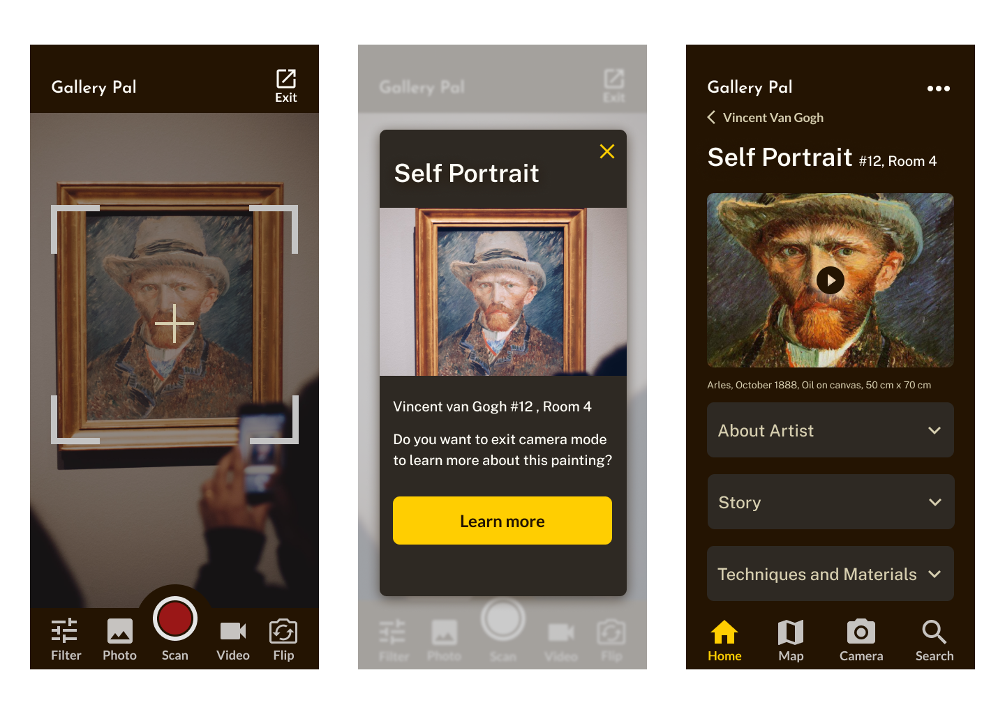
A user selects a painting to learn more by watching videos and reading information. The user also can learn more details about the artist's life, style, and technics.
Day 3: Storyboard
Day 4: Prototype
Why it’s better than existing apps:
1. No e-ticketing. I think guide apps do not need to provide ticket purchasing options. I want to focus on providing more engaging content about artwork and artists.


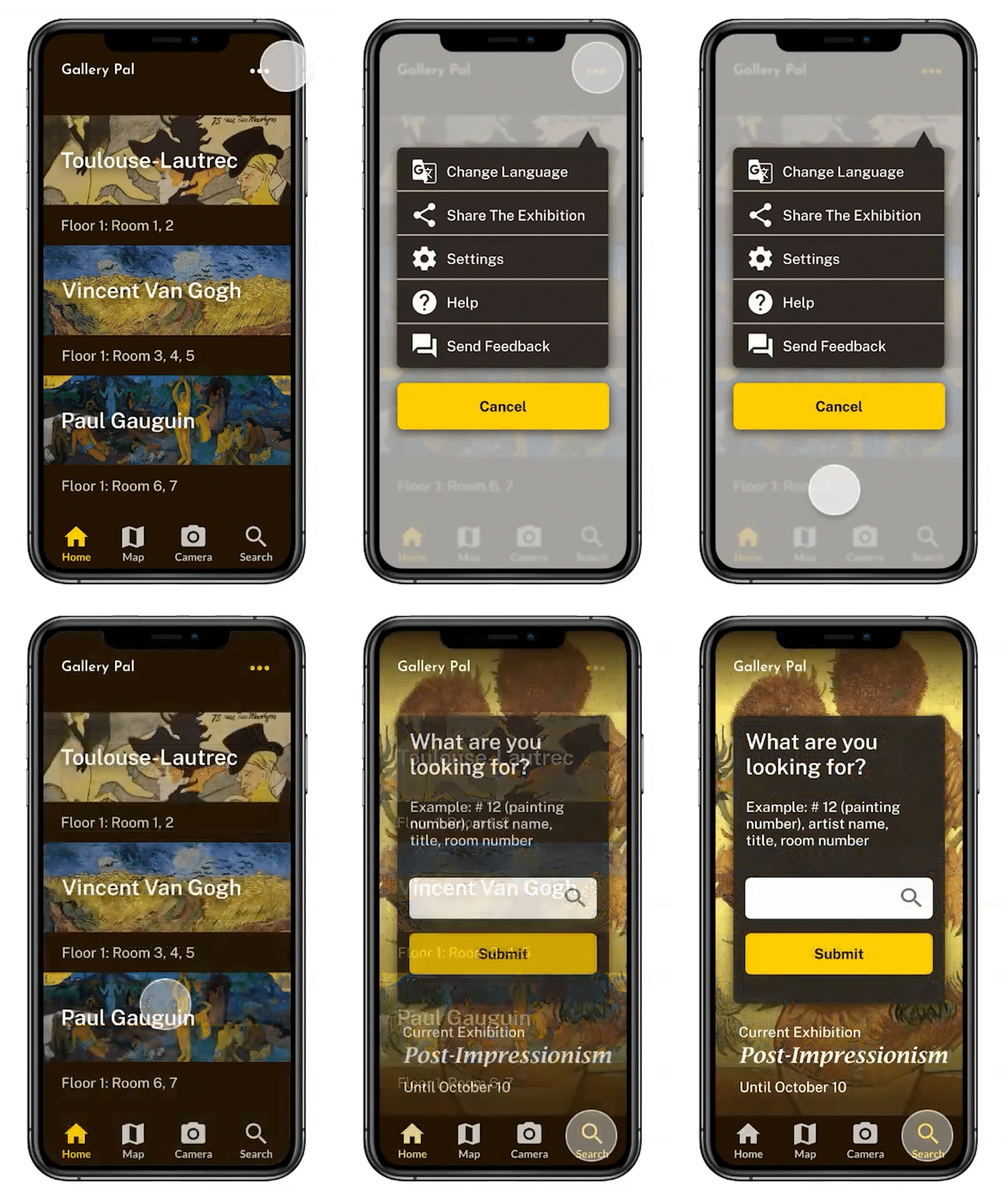
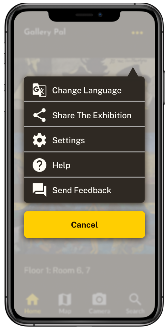
2. Simpler design and options. Many existing apps provide too much information and options.


3. The camera can scan an artwork to find related information faster and easier.
4. Users often want to take a photo of an artwork and post it to Facebook or Instagram.
5. Familiar and simpler navigation and map
Day 5: Validation and Revision
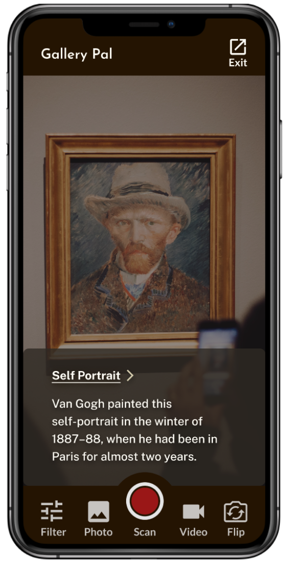
Augmented Reality(AR) scanning to get information
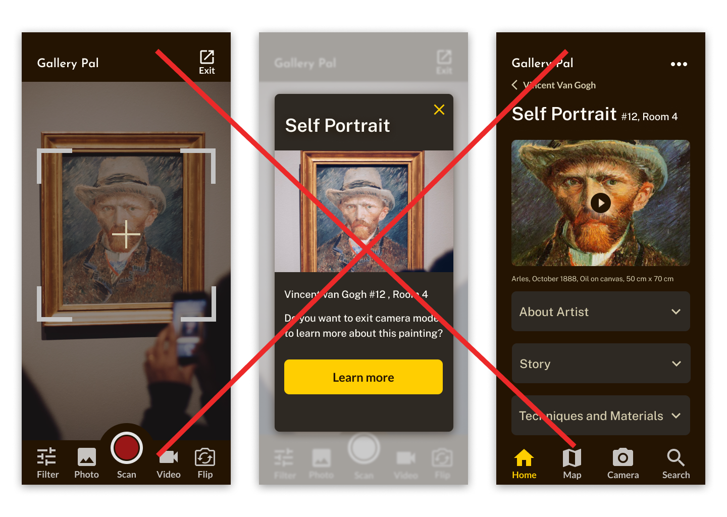
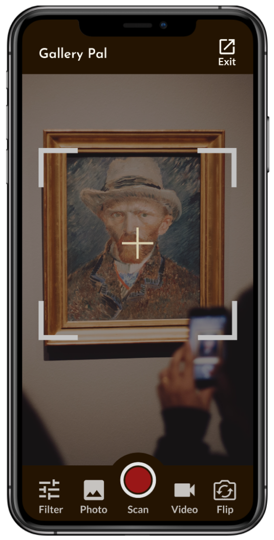
My first design for scanning a painting requires 4 steps to get information about the painting. After getting some feedbacks from user tests, I adapted AR technology for faster scanning and providing information. Users can get basic information about the chosen painting by only one click after accessing a camera.
Before
After

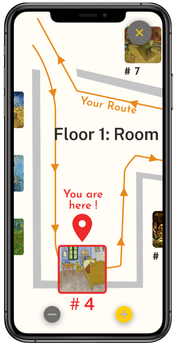
Current location with two route options
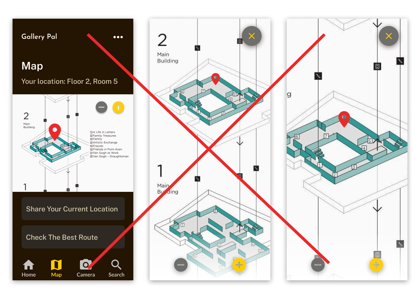
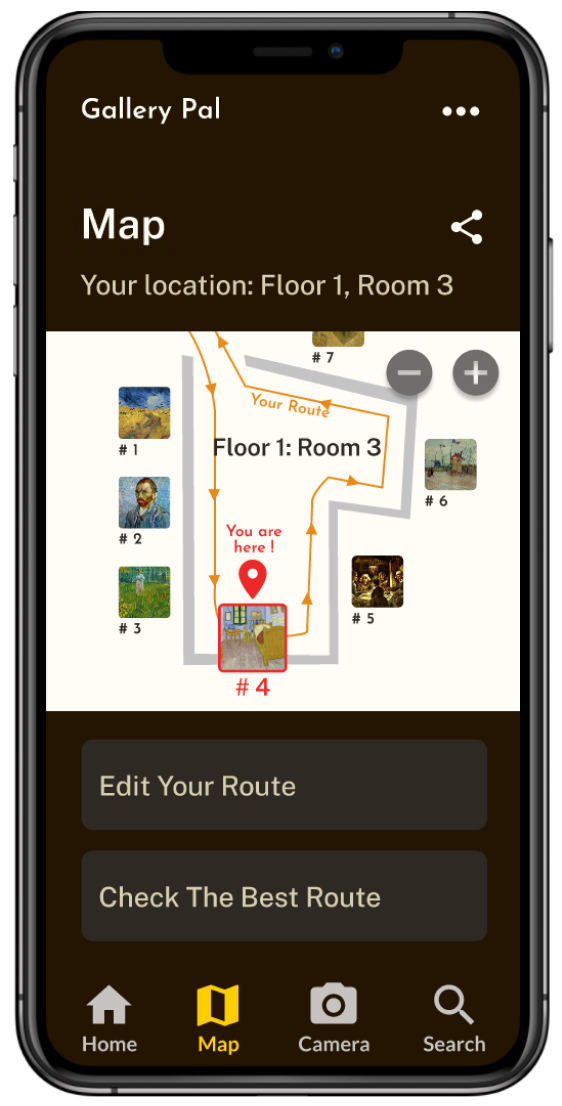
A user might be confused about his/her current location when his/her see multiple floors on the map. Showing user's current location/floor might be much simpler. The closest painting of user's location is appeared with a image number, so the user can look up the painting information faster and easier. The user can create and edit his/her own route or can chose app's suggested route, "the best route."
Before
After
Faster launching
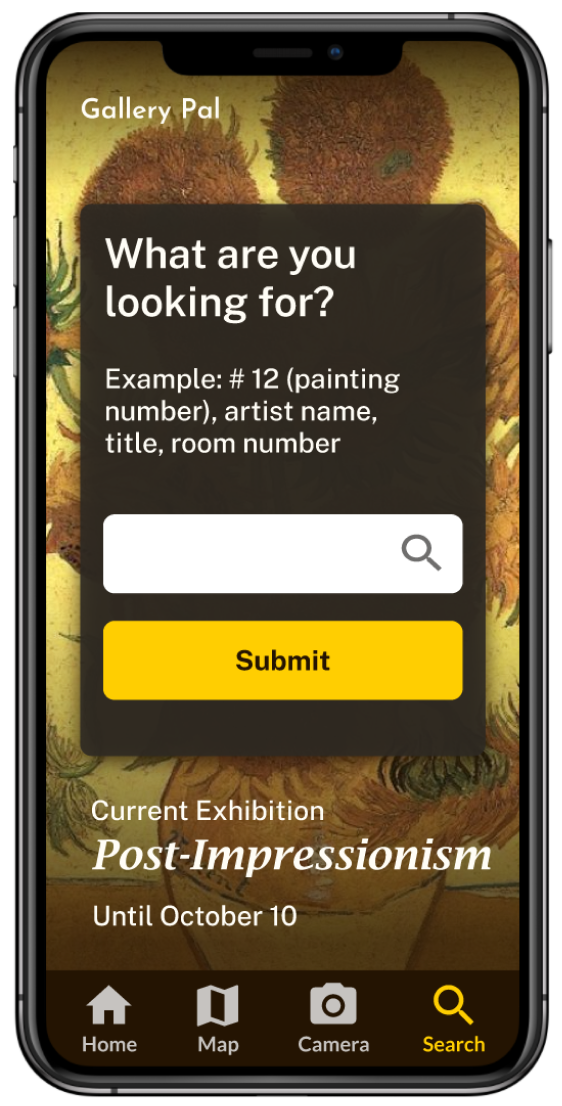
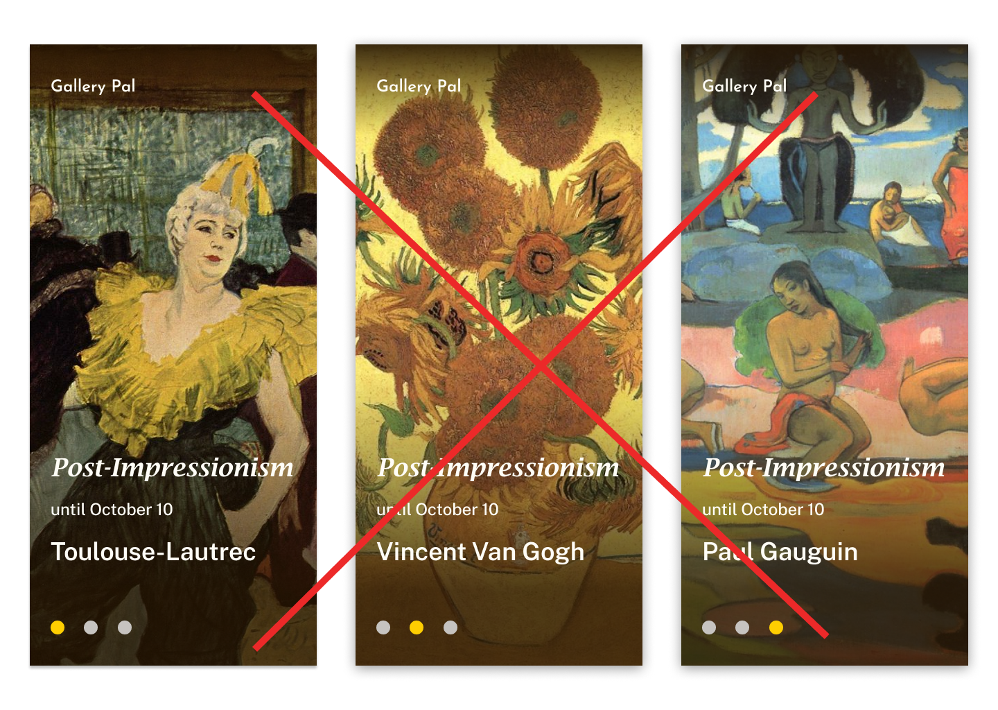
The initial design has 3 intro pages about the current exhibition. For faster launching, I omitted the intro pages because the exhibition information is redundant when users are already inside of the museum and gallery after ticketing. Users will directly go to the main page after launching the app and they can navigate or set up right away.
Before
After
