Designing the free to paid user experience for a media app, High
Timeline
4 weeks
My Role
Logo design, company branding, secondary research, competitor analysis, network/online ethnography, user interviews, affinity mapping, user flow, wireframes, low-fidelity & high-fidelity mock-up, user testing, prototype
BackgroundThe High is a startup company that launched a media product two years ago. It is a freemium model with a mobile-web experience and a mobile app for iOS and Android. The High wants to convert a current free media product to a paid product and have more new paid subscribers by improving signup flow.
Target User Characteristics
1. 18-24 years old
2. Very tech-savvy — they are on their phones for several hours a day
3. Very budget-conscious
4. This type of media [music/movies/books] is a very important part of their lives
2. Very tech-savvy — they are on their phones for several hours a day
3. Very budget-conscious
4. This type of media [music/movies/books] is a very important part of their lives
Research
Research Objective
Learn user’s motivation to transition from free to a paid membership.
Research QuestionsHow might we convert free users to paid users?
Why does a user want to change from free to a paid membership?
How might we improve the signup process?
Why does a user want to change from free to a paid membership?
How might we improve the signup process?
Research Methods
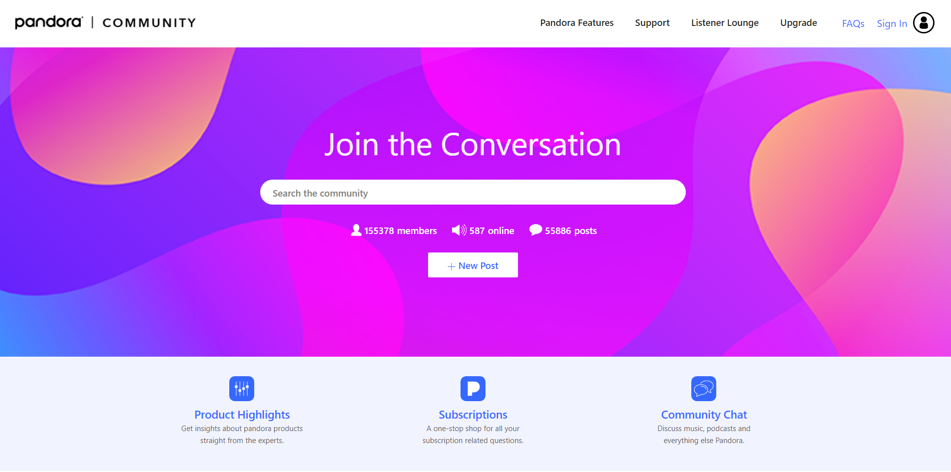
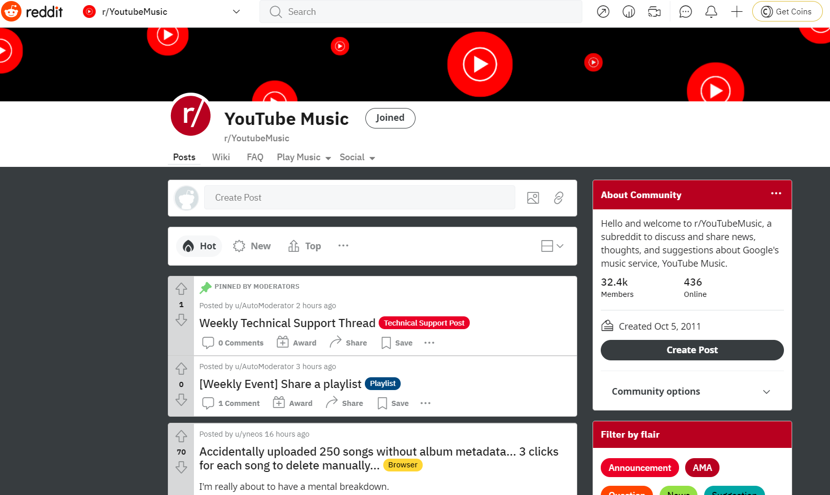
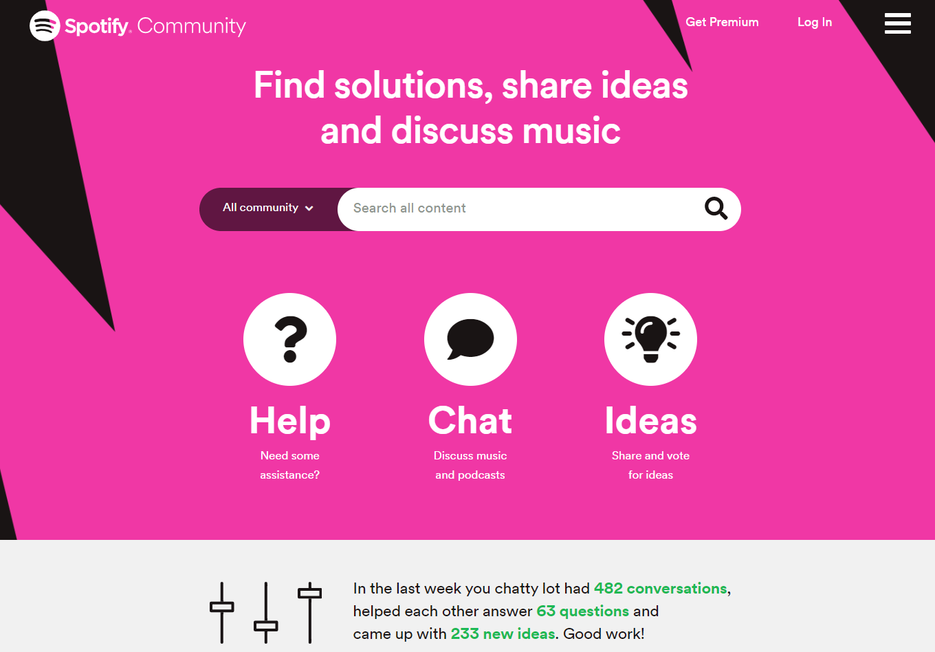
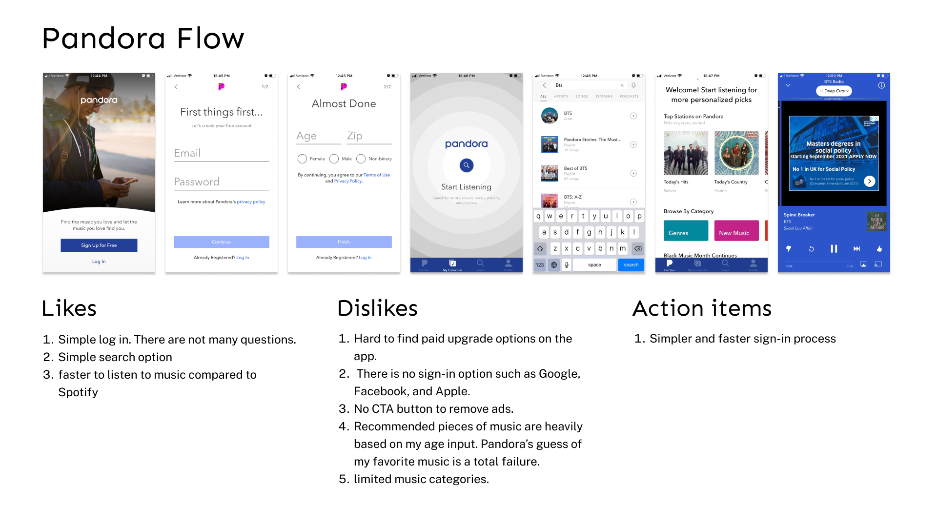
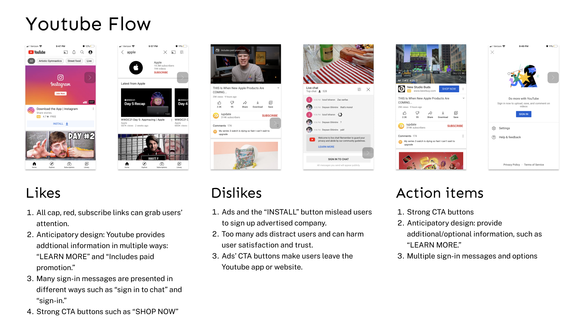
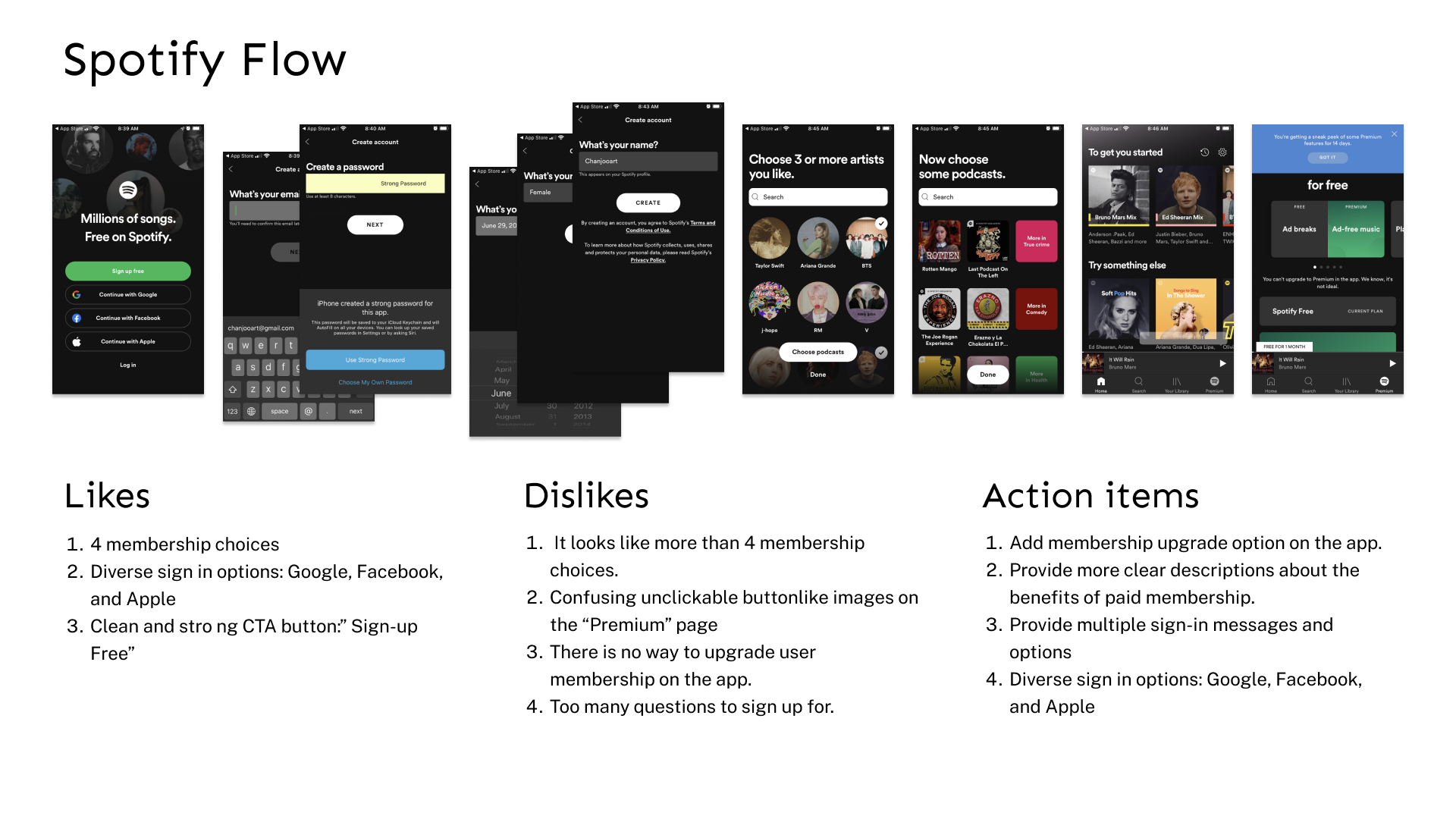
Secondary analysis to understand conversion and signup problems from competitors’ products ( Spotify, Youtube, Pandora.) Network/online Ethnography to get feedback on user needs and problems related to transitioning to paid memberships through online conversations in-app reviews and online communities.
Online Communities
1. Social Media outreach: Reddit, Facebook, Slack
2. Google store app reviews
3. Online Community
2. Google store app reviews
3. Online Community
Why Online Ethnography?
An online research method that adapts ethnographic methods to the study of the communities and cultures created through computer-mediated social interaction.
1. Easy to access broader users from many countries.
2. More accessible during the global pandemic area.
3. Free and fast to overcome budget and time limitations.
4. Compare old data and reviews to the most recent reviews and data.
5. Try votes or short surveys in the online community.
6. Gather many current users' opinions for a short period of time.
Affinity Map
Why convert to a paid membership?
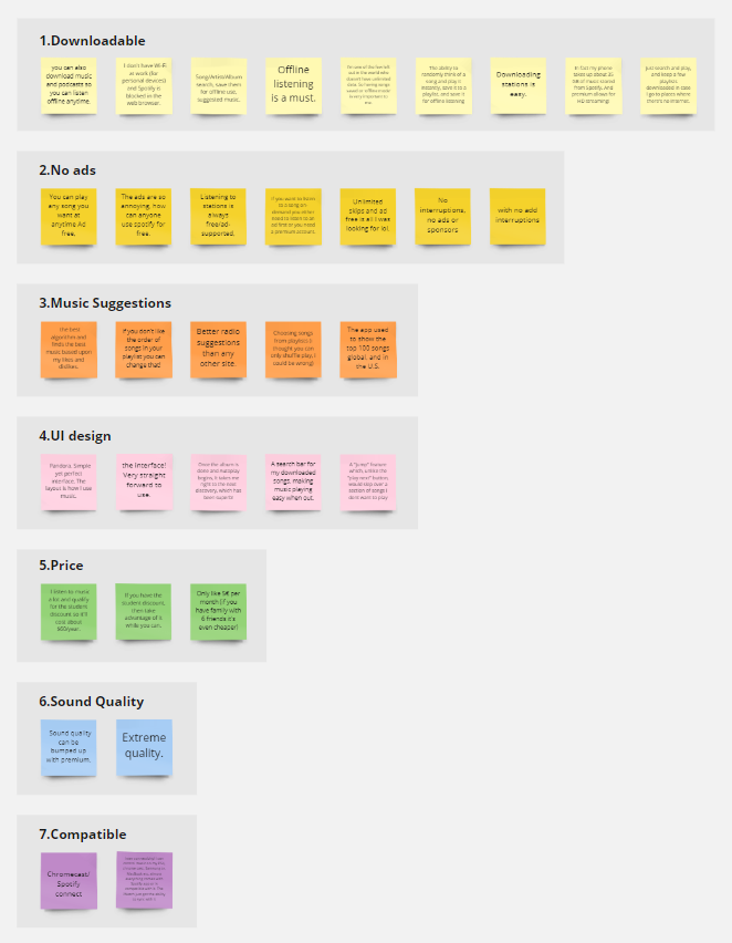
Synthesizing Research
Reasons for converting to a paid membership
“Unlimited skips and ad-free is all I was looking for.”
1. Users hate ads.
2. They want to build their own playlists.
3. They want to download/save music for offline
4. Many users collect a lot of music and their lists need to be searchable.
5. They want to keep their playlist and avoid technical/upgrade problems.
1. Users hate ads.
2. They want to build their own playlists.
3. They want to download/save music for offline
4. Many users collect a lot of music and their lists need to be searchable.
5. They want to keep their playlist and avoid technical/upgrade problems.
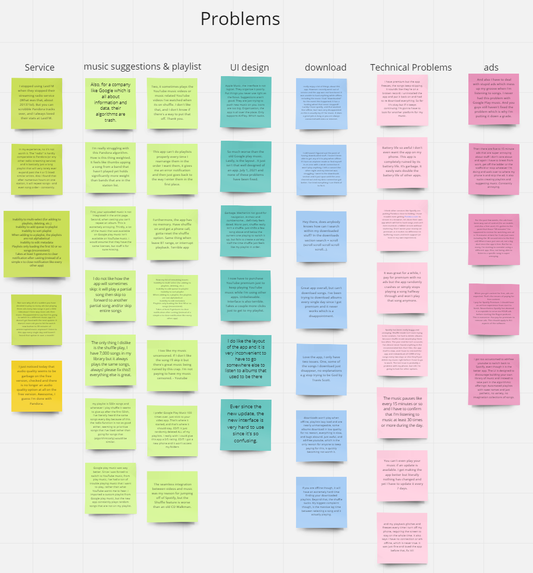
Complaints and problems about music service platform
1. Poor algorithm and wrong music suggestions
2. Technical problems after upgrades - examples
3. Losing continuity after redesigning
4. Hard to search music from a user’s playlist
5. Problematic shuffle options. Keep repeating the same songs.
6. Premium members are still getting ads on radio or podcasts.
2. Technical problems after upgrades - examples
3. Losing continuity after redesigning
4. Hard to search music from a user’s playlist
5. Problematic shuffle options. Keep repeating the same songs.
6. Premium members are still getting ads on radio or podcasts.
Ideation
Must-have items
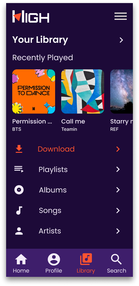
1. No ads
2. Offline mode - downloadable songs
3. Simple UI
4. Service - Better algorithm, better shuffle options
5. Easier and faster search
6. Organized and searchable User’s Playlists
7. Easier Sign-up options - Google, Facebook...
8. Free trials - add credit card number
2. Offline mode - downloadable songs
3. Simple UI
4. Service - Better algorithm, better shuffle options
5. Easier and faster search
6. Organized and searchable User’s Playlists
7. Easier Sign-up options - Google, Facebook...
8. Free trials - add credit card number
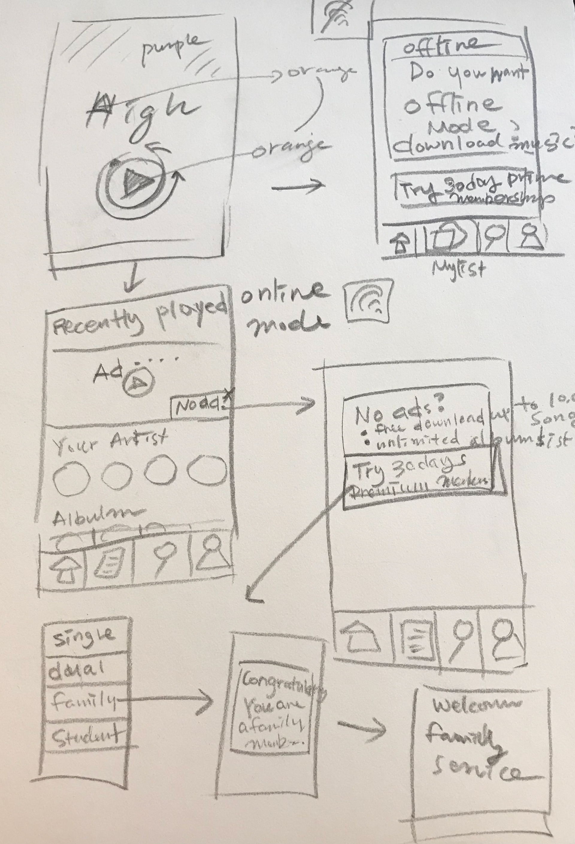
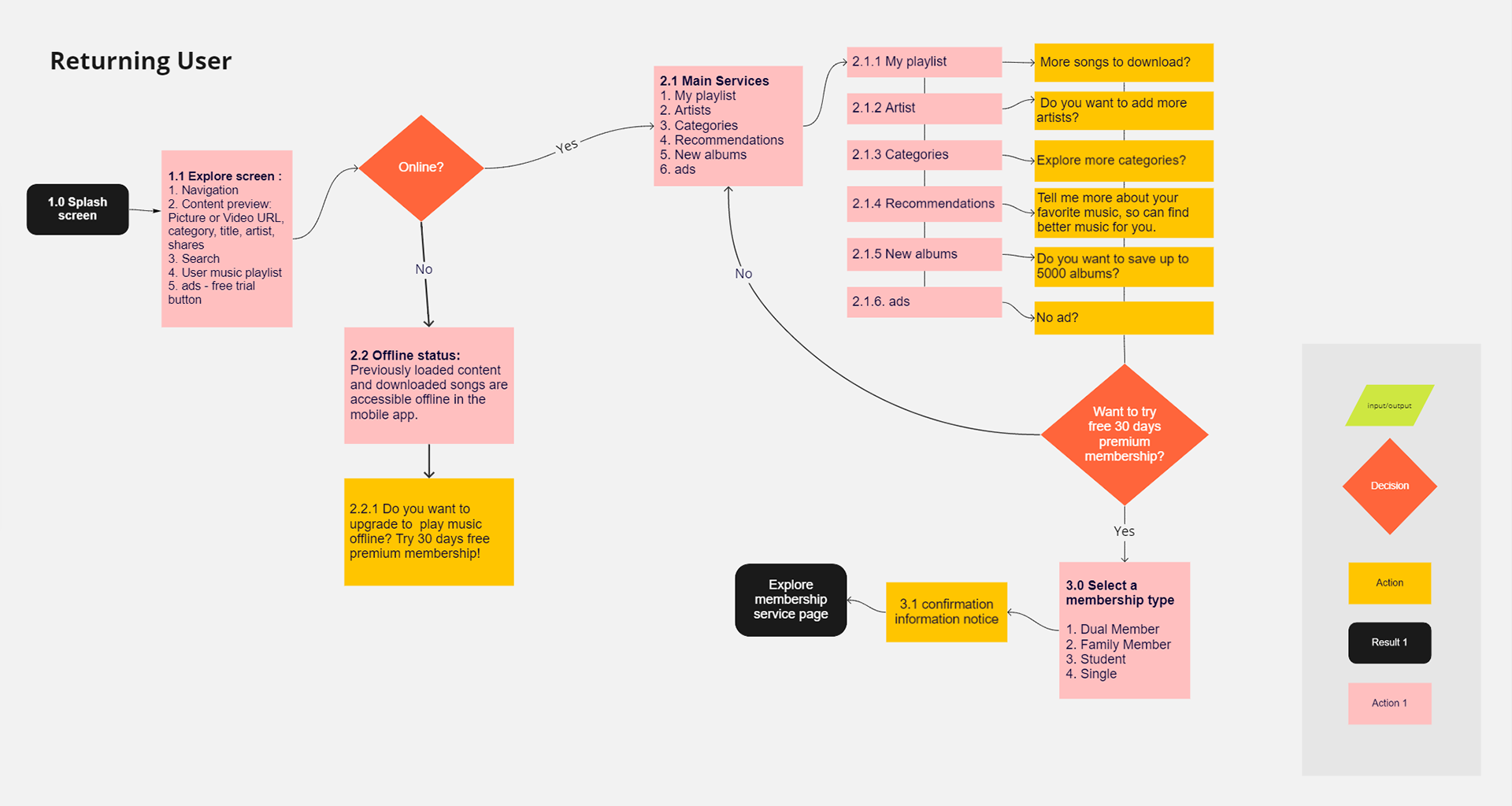
User Flow
Low fidelity wireframes
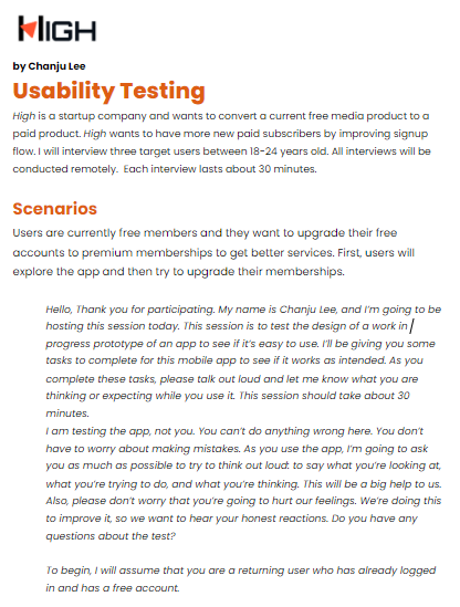
Usability Test
User Comments
1. Participants found it similar to Spotify and it is easy to use.
2. Wayfinding and navigation
a. Hamburger button: setting, audio control, profile, customizing skins
b. Library: Favorite music, history
c. Profile: username, friends, membership
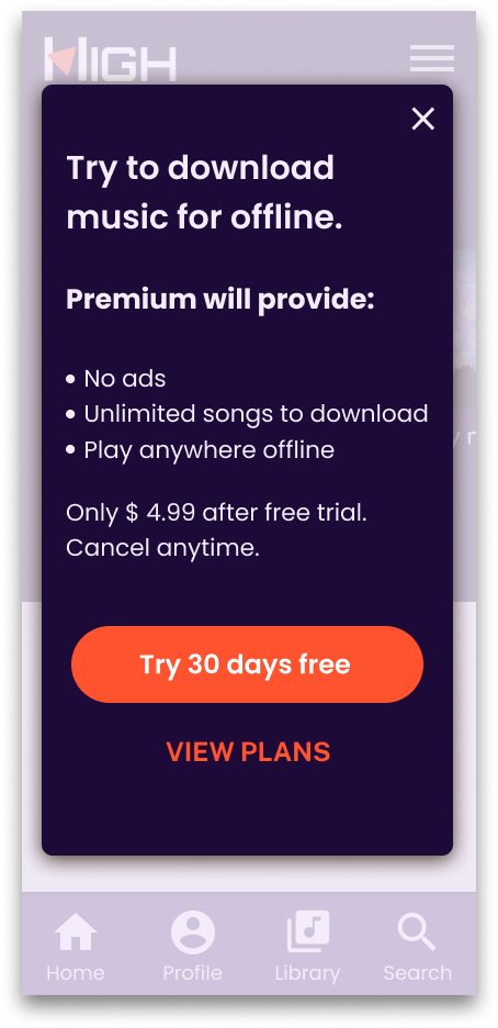
3. Improving content to be more specific
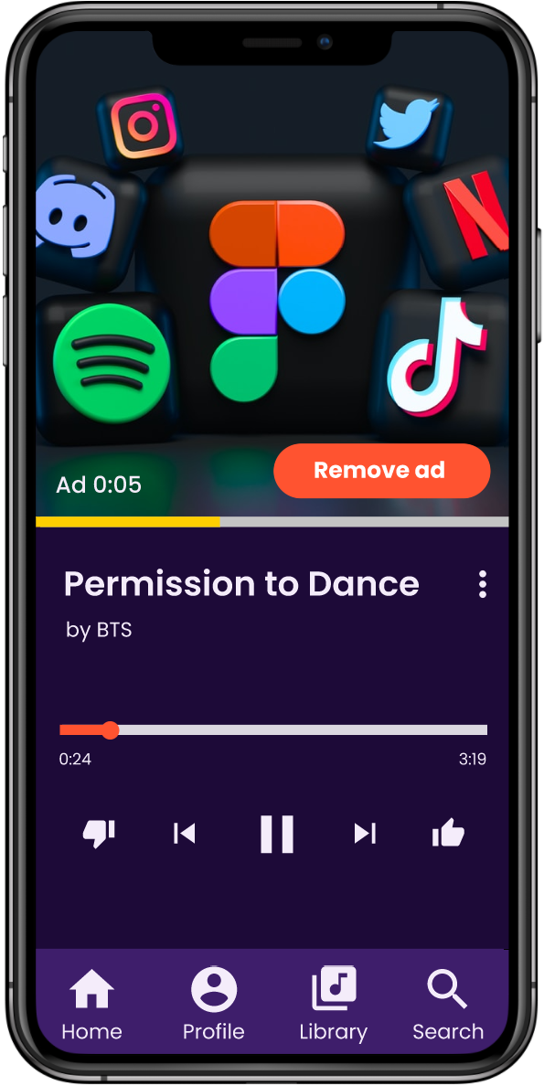
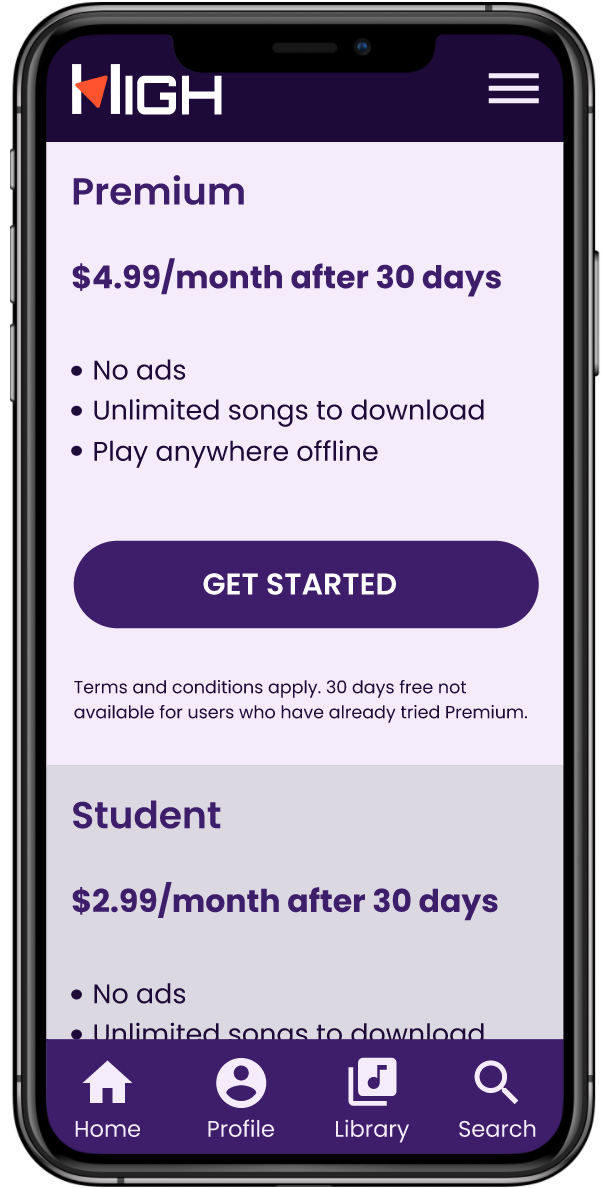
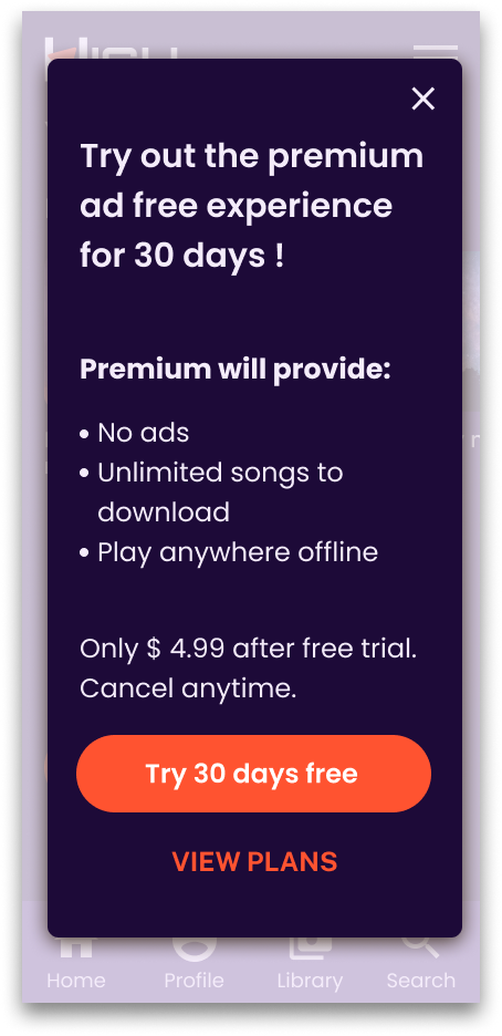
a. “Only $4.99 after free trial” instead of “Only $4.99 after”
b. “Remove ads” “No ads”
c. ” Explore the premium service” instead of “Explore your service”
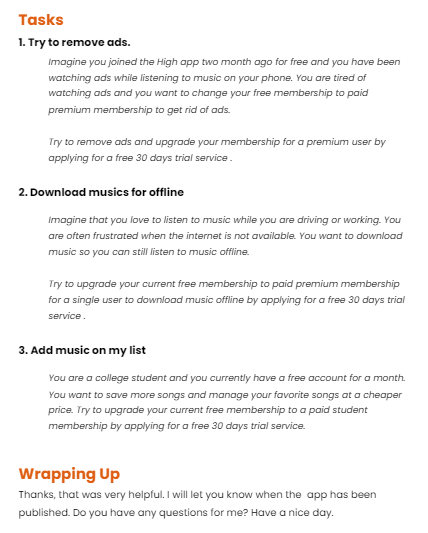
Task results
3 users completed the 3 tasks successfully. The site is similar to Spotify or Youtube so they can easily understand what to do.
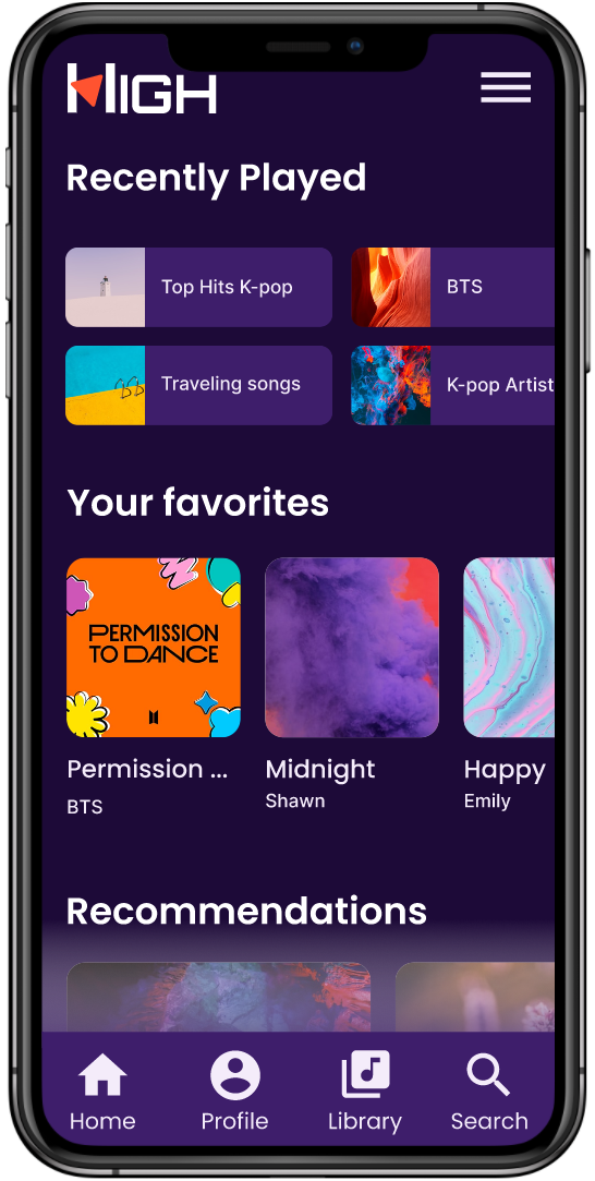
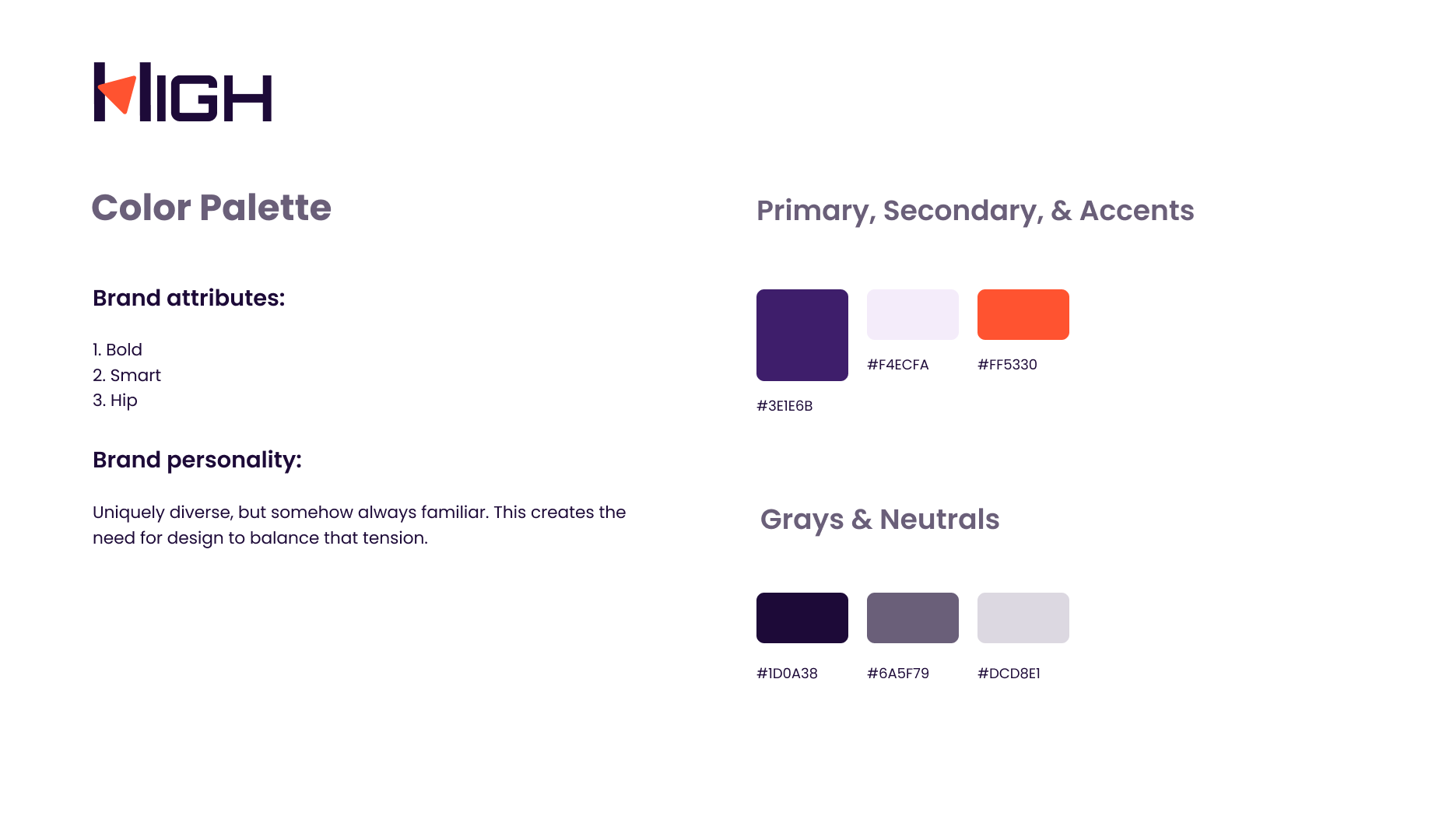
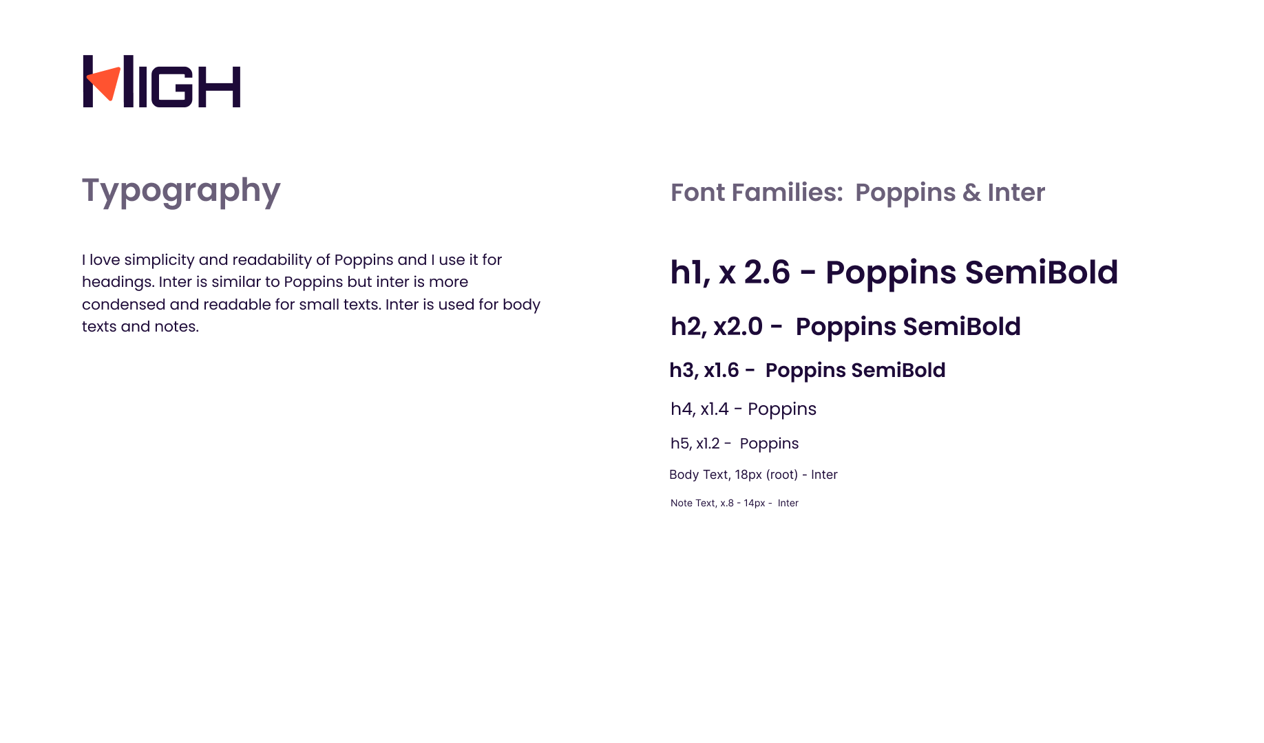
Branding
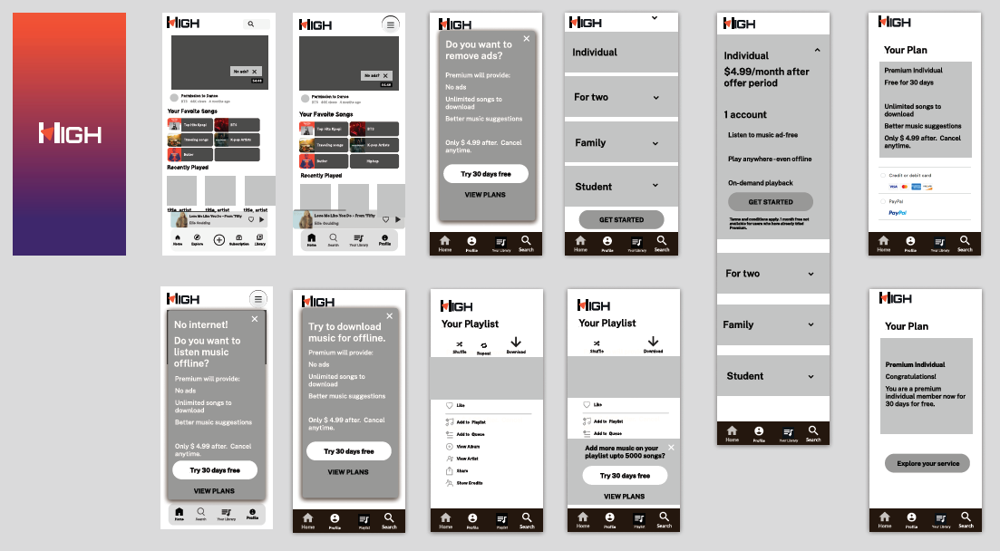
Prototype


Conclusion
Using findings from competitors and online ethnography research, I created a new brand for the High app and designed a free to premium conversion model to more effectively monetize their platform. In consideration of our target user’s younger demographics and competitors, I designed two paid membership levels: premium and student.
What’s next?
I want to design fast and easy payment flows by adapting photo scanning and add user-friendly multi-skin options on the setting.
Lessons Learned
I tried to put simple messages with prominent CTA buttons to lead the free users to the paid membership page. By user testing, I learned that users can be confused if the descriptions are not clear enough. Condensed and short descriptions are more readable and help users anticipate what will come after clicking buttons.